
 Case Converter
 Lorem ipsum Generator
 HTML Email Button Generator
 Coupon Code Generator
 SEO Keyword Generator
 Random Maze Generator
 Animations CSS Generator
 Extract Text From An Image
 Js Base-62 Encode Tools
 Fancy Font Generator
 Zalgo Text Generator
 Italic Text Generator
 Upside Down Text
 Square Text Generator
 Underline Text Generator
 Strikethrough Text Generator
 Tiktok Style Text
 HTML Stripper
 HTML to Markdown
 Sentence Counter
 Markdown Editor
 HTML to PUG Converter
 Bionic Reading Converter
 Wordcloud Generator
 Google Fonts Pair Finder
 Binary to Text
 Text to Binary
 Small Text Generator
 Text in Alphabetical Order
 Remove Duplicate Lines
 SVG Blob Generator
 Image to Base64 Converter
 SVG Remove Whitespace
 SVG Path Builder
 SVG Polygon Generator
 Favicon Generator
 Photo Editor
 Upscale an Image
 GIF to SVG Converter
 HEIC to JPG Converter
 MP4 to GIF Converter
 Dynamic Dummy Image
 Image Color Picker
 Watermark Image
 YouTube Style Logo
 Barcode Generator
 Code to Image Converter
 Photo Censor
 SVG to PNG Converter
 Hexa String to PNG
 Hexa String To SVG
 Hexa String To VML
 VML To PNG
 VML To SVG
 CSS Background Pattern Generator
 CSS Cubic Bezier Generator
 CSS Glassmorphism Generator
 CSS Gradient Generator
 CSS Triangle Generator
 CSS Box Shadow Generator
 CSS Border Radius Generator
 React Native Shadow Generator
 CSS Section Separator Generator
 Web Responsive
 CSS Auto-Prefix Converter
 CSS Clippath Generator
 CSS Loader Generator
 CSS Pattern Generator
 CSS Hover Effect Generator
 CSS Convert Hex To Filter From Black
 CSS Cursor Viewer
 SCSS To CSS Compiler
 CSS To SCSS Compiler
 CSS Fancy Border Radius
 CSS Checkbox Generator
 CSS Column Generator
 Bootstrap 3 Customizer
 CSS Flexbox Generator
 CSS Flip Switch Generator
 CSS Filter Generator
 CSS 3D Transform Generator
 CSS Ribbon Generator
 CSS Corner Ribbon Generator
 Canvas Draw Code Generator
 Mobile menu icon animations
 CSS Buttons
 CSS3 Loading animations
 CSS Toggles
 CSS Tooltip Generator
 CSS Text Gradient Generator
 CSS Scrollbar Generator
 CSS Text Shadow Generator
 Background Image CSS Generator
 Border Image CSS Generator
 Outline CSS Generator
 SVG Wave Generator
 CSS Shapes Generator
 Underline Generator
 3D Book Image CSS Generator
 Social Media Icon Generator
 Smoky Backgrounds Generator
 CSS Grid Generator
 CSS Minifier
 HTML Minifier
 XML Minifier
 SQL Minifier
 CSS Text Glitch Effect Generator
 Grid Generator
 Bootstrap Form Builder
 Bootstrap 3 Builder
 Font-Face Code Generator
 URL Slug Generator
 JSON to String
 Meta Tag Generator
 JSON Object to CSV Converter
 XML to JSON Converter
 JSON To XML Converter
 JSON To CSV Converter
 JSON to Excel Converter
 JSON to YAML Converter
 Htaccess Generator
 Robots-txt Generator
 Split Text File
 CSV To HTML MediaWiki
 CSV to PDF Converter
 CSV to XML Converter
 Base64 Decoder
 CSV to JSON Converter
 XML Viewer
 CSV to SQL
 Excel To JSON Converter
 Mail To Generator
 API Key Generator
 Base64 Encoder
 Comment Generator
 Social media Font Generator
 Check My IP or My User Agent
 SQL Form Generator
 Checksum Calculator
 Phone Number to IP Address Converter
 Curl to PHP
 GIF Splitter
 Gzip Decompress
 JSON to PHP Array Converter
 Text Cleaner
 Marquee Generator
 Htpasswd Generator
 Chmod Calculator
 HTML Table Generator
 Convert Text to Handwriting
 Pie Chart Canvas Generator
 Signature Generator
 Minecraft Colored Text Generator
 Gzip Compress
 Deflate Compress
 Deflate Decompress
 Methods of Payment
 UUID Generator
 Email Signature Generator
 Text List To Array [ ]
 Compare Two Lists
 IP Generate
 Random Dates Generate
 Random Color Generator
 Random Emoji Generator
 Random Letter Generate
 Random line picker
 Playing Card Shuffler
 Coin Flipper
 Dice Roller
 Random Byte Generator
 Lottery Quick Pick
 Crontab Generator
 Email Template Generator
 Random Integer Generator
 GUID Generator
 Validate Codes
 Share Link Generator
.png) Tone Generator
Tone Generator
 Line Break Removal
 Uncompressed HTML Code
 HTML Character Encoder
 Compress HTML
 HEX to RGBA Converter
 RGBA to HEX Converter
 Color Mixer generator
 Instagram Photo Downloader
 Twitter Tweet Generator
 Text to Speech Reader
 Speech to text Generator
 Random Name Picker Generator
 MP3 Cutter
 MP4 to MP3
 SVG to AI
 YouTube to MP3
 Instagram Post Generator
 YouTube Tag Extractor
 YouTube Tag Generator
 YouTube Thumbnail Downloader
 Social Media Name Checker
 Password Generator
 QR Code Generator
 CSS/SVG Barcode Generator
 MD5 Encryption Converter
 SHA1 Hash Generator
 URL Encoder & Decoder
 CSR Generator
 CSR Decoder
 Privacy Policy Generator
 Server Headers Checker
 Check Website OS
 SMTP Test
.png) HTACCESS Redirect Generator
HTACCESS Redirect Generator
 URL Rewrite Generator
 Open Graph Checker
 Cookies Policy Generator
 Terms and Conditions Generator
 Disclaimer Generator
 EULA Generator
 Return & Refund Policy Generator
 Credit Card Generator
 Credit Card Checker
 Inventory SKU Generator
 Hashtag Counter
 Pop-up Window
 URL Encoder
 IP Pinger - Ping IPv4 Address
 CNAME Lookup
 DKIM Record Lookup
 DMARC Record
 DMARC Validation
 DNSKEY Checker
 DS Lookup
 IP Subnet IPv4 or IPv6 Calculator
 IP to Decimal
 IP Pinger - Ping IPv6 Address
 IPv6 WHOIS
 IP WHOIS
 MX Lookup
 NS Lookup
 Port Checker
 Reverse IP
 SPF Checker
 Google Hacking
 XML To OCMOD Converter
 OCMOD To VQMOD Converter
 Twig to PHP or TPL Online Converter
 PHP to Twig Converter
 Number To Words Converter
 Words to Number Converter
 REM to PX Converter
 Countdown Timer
 Scoreboard
 Stopwatch
 ALT codes for windows
 Unicode characters table
 Interest Calculator
 EMI Calculator
 Savings Goal Calculator
 Electric & Energy Usage Calculator
.png) Square Footage Calculator
Square Footage Calculator
 Tile Calculator
 Height Calculator
 Electricity Calculator
 IP Subnet Calculator
 Bandwidth Calculator
 Tip Calculator
 Love Calculator
 Travel Cost Calculator
 Furniture Calculator
 Guest Rent Calculator
 Loud Calculator
 Rent Splitting Calculator
 Weight Converter
 Length Converter
 Area Converter
 Speed Converter
 Temperature Converter
 TimeZone Converter
 Time Converter
 Volume Converter
 Currency Converter
 Timestamp
 Power Converter
 Energy Converter
 Force Converter
 Angle Converter
 Numbers Converter
 Data Storage Converter
 UPS Batteries Load Calculator
 PDF to Image Converter
 PDF Merge Converter
 Compress PDF Converter
 URL to PDF Generator
 Web page to jpg
 Extract PDF Tools
 HTML to PDF Converter
 JPG to PDF Converter
 PDF Editor
 Word to PDF Converter
 Digitally Sign a PDF
 Delete a PDF Pages
 PDF Maker
 Protect PDF
 Unlock PDF
 Age Calculator
 Date Calculator
 Business Date Calculator
 Business Days Calculator
 Calculate Duration Between Two Dates
 Chronological Age Calculator
 Time Card Calculator
 Schema Generator
 Keyboard Tester
 Mouse Button Click Test
 Refresh Rate Tester
 Microphone Tester
 Webcam Tester
 Dead Pixel
 Number To WhatsApp
 Vibration Simulator
 Screen Recorder
 Bar Graph Maker
 Line Graph Maker
 Pie/Circle Chart Maker
 Scatter Plot Maker
 Table Chart Maker
 HTML To WordPress Theme
 WordPress Admin Side Tools
 Wordpress Setting Page Generator
 Wordpress Content Tools
 Wordpress Core Tools
 Wordpress Design Tools
 Wordpress Mail Function Generator
 Wordpress Query Tools
 WordPress Plugin Tools
 Healthy Weight Calculator
 BMI Calculator
 Body Type Calculator
 Calories Burned Calculator
 Ideal Weight Calculator
 Army Body Fat Calculator
 BMR Calculator
 Body Fat Calculator
 Calorie Calculator
 Shopify Product Data Generator
 Shopify Section Schema Generator
 Play Games

How to Test Responsive Web Design Cross-Browser Compatibility
HTML is an inherently fluid medium. Text and containers expand horizontally and vertically to use the available space. That fluidity made complex designs more difficult, so by the turn of the millennium, many sites adopted a fixed-width based on popular screen sizes.
The process remained viable as screen sizes kept increasing from 800×600 to 1024×768 and beyond. However, the rise of smartphones and the iPhone launch in 2007 reversed that trend. Today, more than half of users access web pages on a smaller mobile device .
Note: Technically, smartphones often have a higher resolution than many monitors, but individual pixels become invisible. An iPhone 11 Max translates its 2688 x 1242 hardware resolution to a more practical 896 × 414 logical resolution. Each logical pixel maps to a grid of 3×3 real pixels, which enables smoother fonts and increased image detail.
The initial workaround was two sites: one for desktop and one for mobile, often with user agent sniffing to redirect as necessary. This rapidly became impractical as the variety of devices grew exponentially.
Finally, the term Responsive Web Design (RWD) was devised by Ethan Marcotte in 2010 . The technique allowed the same site to work on any device regardless of screen size or viewport dimensions.
How Does RWD Work?
There’s no single RWD approach or technology.
First, you must determine how a site design will react to differently sized displays. This is a challenge, and many of the first RWD sites took an existing desktop layout and removed sections as screen dimensions reduced.
A better technique was mobile first. It started with a linear mobile view, which worked on all devices then rearranged or adapted content as more space and supported browser features became available. More recently, many sites have adopted simpler layouts, where the mobile and desktop experience is mostly similar.
A typical example of RWD in action is the hamburger menu. Those on smaller screens can click an icon to view navigation links, while those with larger screens may see all the options in a horizontal list.
The following sections provide a number of technical implementation options.
HTML viewport Meta Tag
Regardless of any RWD technique, the following tag must be set in your HTML <head>:
The width=device-width setting ensures mobile browsers scale logical CSS pixels to the width of the screen. Without this, the browser will presume it’s rendering a desktop site and scale it accordingly so it can be panned and zoomed.
Media Queries
Media queries were the primary basis of the first RWD sites. They allow CSS to target specific ranges of viewport dimension. For example:
Media queries are still used, although less explicit options are now available.
<picture> Elements
The HTML <picture> element uses media query syntax to control which image is displayed from a choice of <source> options. This is typically used for art direction in order to display a suitable image for device viewport. For example:
CSS Viewport Units
The vw and vh CSS units represent 1% of the viewport’s width and height respectively. vmin is 1% of the smallest dimension, and vmax is 1% of the largest dimension.
These permit RWD flexibility, especially when used in conjunction with calc. For example:
CSS Columns
CSS multi-column layouts provide a way to create multiple text columns as the dimensions of a container increase. For example:
CSS Flexbox and Grid
CSS Flexbox and CSS Grid provide modern techniques which lay out child elements depending on their content and the space available. The primary difference:
- Flexbox is used for one-dimensional layouts. Elements can wrap (or not) to the next line as necessary so columns may not line up.
- Grid is for two-dimensional layouts, usually with identifiable rows and columns.
Either can be used to create an intrinsic layout ( a term devised by Jen Simmons ). In essence, elements are sized according to the viewport dimensions without the need for media queries. For example:
JavaScript RWD Options
JavaScript can also be used to determine viewport dimensions and react accordingly. For example:
Similarly, the dimensions of an individual element can be examined with
offsetWidth
and
offsetHeight
, although the
getBoundingClientRect() method
can return more information including fractions of a pixel:
Window and element dimensions can change as a device is rotated or the browser window is resized. The
matchMedia
API can parse CSS media queries and
trigger change events
:
Browser Support
The RWD technologies above all offer good browser support. The most recent option — CSS Grid — is supported by almost 95% of browsers in use today . However, it’s still necessary to test your site across a range of devices, resolutions, and browsers…
In-browser Testing
Resizing your browser window is a reasonable testing strategy for a few hours, but it rapidly becomes inaccurate and cumbersome. Most browsers offer a Responsive Design Mode which lets you select a device and user agent, rotate it, choose a resolution, alter the pixel density, throttle bandwidth, emulate touch, and take screenshots.
In Firefox, select Responsive Design Mode from the Web Developer menu or press Ctrl | Cmd + Shift + M:

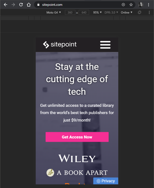
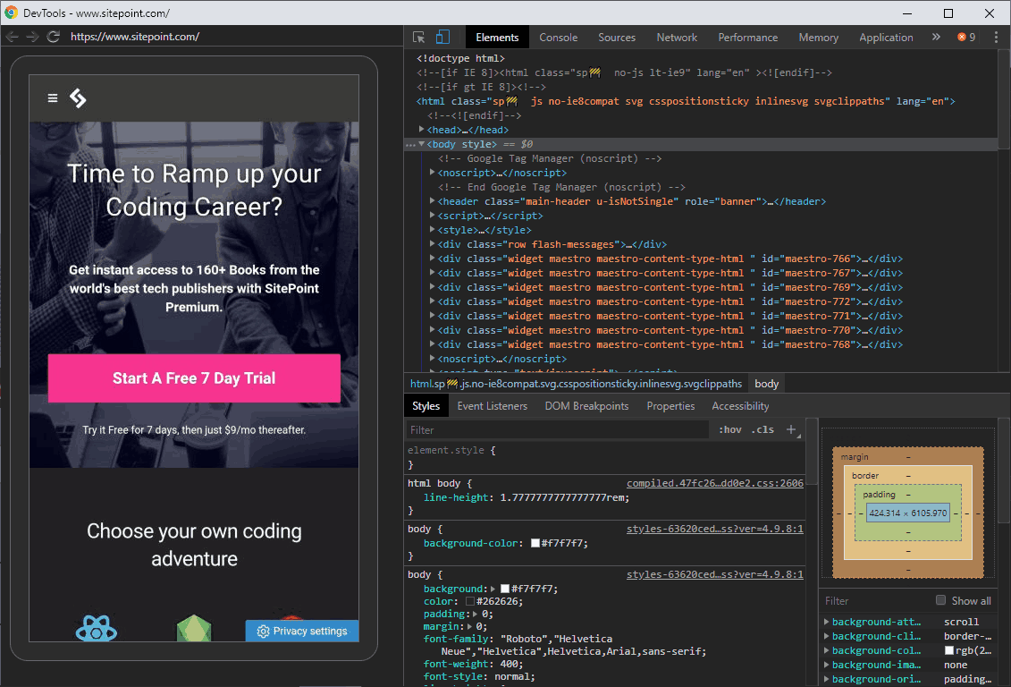
In Chromium-based browsers, open Developer tools from the More tools menu or press Ctrl | Cmd + Shift + I. Then click the Toggle device toolbar icon:
Switch back to the browser tab to view the resized site:
In Safari, enable the Show Develop menu in menu bar option from the Advanced tab of the browser Preferences. Load a page and choose Enter Responsive Design Mode from the Develop menu.
However, be aware that these tools only imitate a device’s screen dimensions and user agent. They cannot accurately emulate the following:
-
Rendering capabilities
The browser will use its own rendering engine — not that of the emulated device. A CSS feature that works in Firefox would “work” on its emulated iPhone view regardless of actual support. That said, Chrome desktop will show a reasonable approximation to Android Chrome, and macOS Safari will be similar to the iPhone because they’re based on the same rendering engines.
-
Older devices
Testing the iPhone browser view on the latest version of Safari cannot accurately represent older devices with legacy operating systems and software.
-
High-density displays
You’re limited to your PC monitor’s physical pixels, so a site may look better or worse on a real device.
-
Touch
A mouse or trackpad has finer control than a touch-screen device with a small display. It may be impossible to view effects applied on-hover.
-
Processing speed
Your PC is likely to have a faster network and processing speed than a mobile device.
Mobile OS Emulators
Running an Android or iOS virtual machine on your device allows you to install and run real mobile browsers and use their actual rendering engines.
Android emulators include:
- Genymotion: free and commercial cloud options, all Android versions for Windows, macOS, and Linux
- Android Studio (and Emulator): free, Windows, macOS, and Linux
- Visual Studio Xamarin (and Emulators): commercial, Windows and macOS
- Bliss OS : free, Android 9 for Windows, Linux, and Chrome OS
- Phoenix OS: free, Android 7.1 or 5.1 for Windows and macOS
- Android-x86: free Android ISOs for any virtual machine platform.
Chrome is the obvious browser choice for Android, but you can also install Opera Mini, which is prominent on lower-powered feature phones.
Options for iOS are more limited:
- Apple Xcode (and Emulator): commercial, macOS
- Electric Mobile Studio: commercial, Windows
- iPadian simulator: commercial, Windows
These emulators still have downsides:
- The software requires some technical expertise and uses considerable system resources.
- Many iOS options are simulators. They adapt another rendering engine and will not always be accurate.
Online Testing Services
This segment was created in partnership with Lambda Test. Thank you for supporting the partners who make SitePoint possible.
Several online services allow you to test responsive pages on mobile browsers over the Web. In essence, you rent time on a real device and can view its screen in your browser. There’s no software to set up or maintain.
As well as live testing, some services include automated testing APIs which allow you to run scripts and check for styling regressions or broken user interfaces.
LambdaTest provides more than 2,000 combinations of device, OS, and browser. Features include:
- testing
localhostpages running on your development PC - debugging with integrated developer tools
- geolocation testing from different locations
- automatically generated, full-page screenshots across multiple devices
- a built-in issue tracker
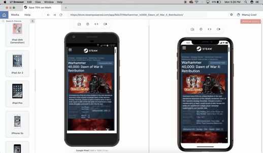
- LT Browser software (Windows, macOS, Linux) to test and compare devices with auto-reload and scroll sync
- Selenium-based automated test APIs
- 24/7 support
- a free plan with unlimited access from $15 per month.
Sign up for a free LambdaTest account …
Alternative services which also provide live and automated mobile testing include:
-
Browserstack
-
Sauce Labs
-
CrossBrowserTesting
Real Device Testing
Finally, there’s no substitute for testing on real devices. It’s the best way to assess actual processing speed, touch control, and your site’s responsive web design.
Ideally, you should test as many devices as possible, but your own recent smartphone may not be indicative of average hardware. Try to obtain mid-range devices that are a year or two old, such as a second-hand Moto G7 or iPhone 8.
Devices on the same network can access your PC’s server by entering its IP address in the browser. This can be obtained with ifconfig on macOS and Linux or ipconfig on Windows.
You can also connect a smartphone to your PC with a USB cable. This allows you to remote-control the device and easily access its developer tool panels for debugging. The technique varies across platforms but, to debug Android Chrome on the desktop edition of the browser:
- On the Android device, select Developer options from the Settings and enable USB debugging.
- Connect the device to your computer using an appropriate USB cable. The first time you attempt this, you may be prompted to confirm actions on one or both devices.
- Launch Chrome on your PC and open
- Optionally, set Port forwarding — for example, port
8888on the remote device can be forwarded tolocalhost:8888. - Your device should appear in the list. You can now inspect a new or existing tab which opens the device’s developer tools:
To debug Safari for iPhone, do the following:
- Connect your phone to your Apple computer.
- Open the web page you want to debug in Safari on your iPhone.
- Launch Safari on your computer.
- In Safari on the computer, go to Develop > [your iPhone] > [website to inspect]. This will open Safari’s developer tools on your computer, allowing you to debug the site on your iPhone.
One Site, Many Views
Responsive Web Design technologies allow you to create a single website which can be viewed by anyone on any device regardless of technical limitations and boundaries. Making it a great user experience is another matter, but the range and capabilities of testing tools continues to improve.