* Axis range might not work with all settings.
How to create a scatter plot
- Enter the title of the graph.
- For each series, enter data values with space delimiter, label, color and trendline type.
- For each axis, enter minimal axis value, maximal axis value and axis label.
- Press the Draw button to generate the scatter plot.
- Press the × reset button to set default values.
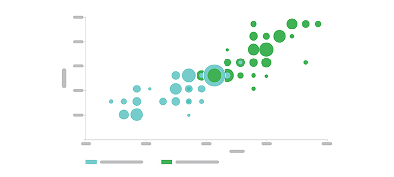
The Scatter Plot Maker is a tool that generates scatter plots, which are used to visualize the relationship between two variables. The tool is designed to help users easily create scatter plots to showcase the correlation between the variables.
Some of the key features of the Scatter Plot Maker include:
- Data Input: The tool allows users to input their data in a simple and straightforward manner. Users can input numerical data for two variables and create a scatter plot that accurately represents the relationship between the two variables.
- Customization: The tool offers various customization options to help users create plots that fit their specific needs. Users can change the color and size of the data points, add a title and axis labels, and adjust the axis ranges to highlight the important aspects of the data.
- Multiple Formats: The generated scatter plots can be saved in a variety of file formats including PNG, JPEG, and PDF, making it easy to share the plots with others or use them in other applications.
- Easy to Use: The Scatter Plot Maker is designed to be user-friendly and easy to use. The tool features a clean and intuitive user interface that allows users to quickly and easily create scatter plots without the need for any specialized knowledge or technical skills.
